

A casual observer would say that front end development is a nebulous term. It encompasses a broad range of practices, tools, technologies, and frameworks. This is true but it takes a lot of skill, talent, and expertise to stay relevant to such an environment. Now that the front end experience has shifted from desktop browsers to mobile devices, and chatbots and Virtual reality have appeared in the show as well, developers need to keep up with many things.
Here are some best design practices that can help front end developers streamline their workflow:
Stack of Tools for Starters
If you don’t want to waste much time developing a web pack, here are some tools you can start using right away:
Create react app
This tool can fire up your react app with one command line. It comes with a plethora of functionalities. It is developed and maintained by the React team so you can expect it to be loaded with great features.
NextJS
It comes with enhanced SEO capabilities. It is more focused on the server-side.
Gatsby JS
This tool is packed with features such as code splitting, pre-fetching, offline support, etc. It has its own routing solution. It uses GraphQL in the interface to fetch data.
Keep CSS and HTML Separate
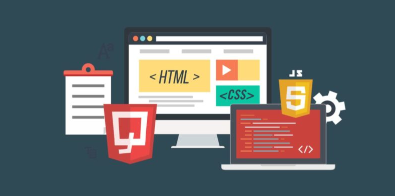


HTML is widely used in front end web development services. It is used for organizing documents by defining the header, footer, text, list, quotes, etc. There was a time front end developers used the HTML attributes for styling elements. Now, they are using CSS into an HTML directly for the style attribute. This comes in very handy when you are in a hurry and testing.
However, this style attribute is considered a bad practice. It goes against the CSS philosophy. The best thing to do is to keep both languages separate.
Design for All Browsers and Devices
Front end developers are not developing for desktop screens alone. They are also developing for mobile web browsing. The best way of dealing with this shift is to design a website that can be adapted to the size of a viewport. Here, a responsive design kicks in.
Responsive design uses flexible images, fluid grids, and some CSS styling techniques to change the design of a website and render it according to the size of the browser. It’s important to test the website on all browsers especially the ones that are commonly used these days.
Work On the Page Speed

The loading time of a website always matters. When you are developing a small website, the page speed is not an issue. The websites that are denser are the ones that take longer to load. There will always be some unavoidable factors that would impact the speed of your page. Here are some best practices to consider when designing a website with respect to speed:
Size of Images
Always be mindful of the image size. The larger an image, the longer it will take to load. At the user’s end, this would consume more bandwidth. Along with the size of the image, the format of the file counts too. PNG, GIF, and JPB are some formats that are quickly loaded by browsers. On the other hand, formats such as BMF and TIFF are heavy and they take more time to load.
It is best to compress the sizes before using them. You can also export images using Adobe Photoshop to reduce the size.
Text Graphics
Whenever possible, avoid using images on the display. As images take more space and load time, this can slow down the website. It is best to keep the text plain.
Code Density
Yes, larger code slows down a website as well. Therefore, optimize your code. You can shorten the CSS files by reusing styles for similar elements. There will be times you feel like you are writing the same code again and again. In that case, it’s best to create a function for it. This will save you a lot of time.
Plugins
Choose your plugins wisely. The more plugins you use on your website, the more time it will take to load. Get rid of all the plugins that are extra. They are simply taking space on your website.

The plugins that are important to you must be updated regularly. This will make your website more secure and stable.
Don’t Rely Too Much On Libraries and Frameworks
There is no harm in mastering a specific library or framework in front end web development. However, don’t rely on them too much. They are built using native languages. They will be updated time after time. The worst thing is they tend to phase out very soon. If you have a strong grip on some native languages, use them. This will ensure that you stay updated with the language trends and best practices.
Place the JavaScript File at the Bottom
In the early 90s, it was a common practice to place JavaScript files in the <head> tags. Avoid doing that. Why? Because the JavaScript file will load before the content and this can disappoint a customer. The right thing to do is to place the file at the bottom of the document. This way, the content will load first and then the files.
Don’t Stop Learning
If you have been in the industry for 3 years or more offering front end development services, you must agree that learning is the key. If you stop learning, you become obsolete very quickly.
Technology is improving at a drastic rate. If you don’t keep up with the use of tools and techniques, you will be replaced. The ability to never stop learning is one of the best practices any front end developer could stick to. You can use the Internet and other free resources to learn a new language that’s trending. Then, you will be ready to tackle any problem work throws at you. This is what all great developers do!
As you follow these best practices, you will be able to handle client requests promptly without compromising on the quality of the project.